Saturday, 24 December 2011
Scene 2- Pub scene improved
This is the scene improved, with the inclusion of Mario, I wanted to include at least one other car in the race, I tried to make sure that Katie speeds off before Mario, I think the improvements I made to this scene are good and were needed, and I am pleased with the second scene.
Scene 2- Pub scene
This clip shows the second scene in the animation, this is the pub scene which shows the start of the race, I have included animated text of the countdown before the race, I am pleased with the art work and how the scene has turned out, however I want to add one of the other race characters.
Monday, 19 December 2011
Digital Skills- Scene 3
Thursday, 8 December 2011
Race Track Scene
This is the next scene in the animation. The racetrack, I made this using textures once again, I will now go about creating Lewis Hamiltons car to place into this scene for the animation.
Pub Scene
This is the next scene of my animation, Straight after Katie is sucked into the TV she ends up at the start of a race in one of her favourite places, a small pub. This was made using various textures for tarmac, checkered finish line and wood as well as images of beer pumps and a pint of beer and pub stools, I also included a pub carpet, I quite like how this scene has turned out.
Because Katie likes Ed Sheeran's music, I thought it would be a good idea to incorporate him into the animation so I used the same technique I used to create Katie character and this was the outcome, I made Ed into a bartender.
I then included Ed in the composition for the scene behind the bar just to see what it would look like in the animation. I then decided I needed to include someone at the bar having a drink.
I made a man to sit at the bar, I used the same technique to create him as I did with Katie and Ed I then wanted to place this man in the composition with Ed sat on a stool at the bar.
Here is the photoshop file with Ed and the Man placed where they should be I must now go on to start making the other scenes and characters so that I can begin to animate them for the final animation, I am very pleased with the outcome of this pub scene.
Tuesday, 6 December 2011
Digital Skills- Scene 1
This is the scene in the living room where Katie is sucked into the TV, I have since changed the character designs and actually given Katie legs therefore I have been able to animate Katie as she flies through the air and into the TV, I key framed the limbs of Katie in order to make her move, This was quite challenging, especially when it came to make Katie move as she was being sucked in. I had to time the movement of Katie's whole body to make sure she wasn't moving before her body started to get sucked into the TV. I have included some moving footage in the background in the form of the pendulum and hand of the clock. Although the movements are quite robotic I am Overall pleased with this scene.
Background/Setting for Scene 1
This is the first 5 seconds of the setting or background for the 1st scene in my animation, I used images from the internet to create the scene of a living room, I tried to include some moving footage in the background by making the pendulum in the clock move as well as the ticking of the hand on the clock. I am pleased with the outcome of this so far.
Character Development for First scene

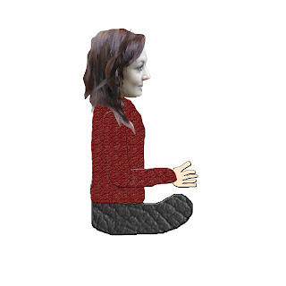
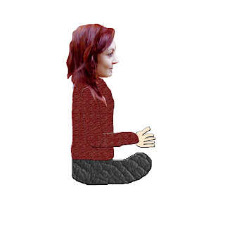
This first image is my initial design for Katie in the first scene of my animation, she sat down and playing the wii, I included the same techniques used to make my character designs with the use of the real life photograph for Katie's head and then the use of textures from Google images to create her clothes, I also cut out a hand shape and filled it to create Katie hands, I then added several layer effects to each of the layers of clothing and the hand.
 During an overview of my work with Jon he suggested I play with the effects in photoshop and therefore showed me some tools for changing colour effects and other handy tools needed to add a bit more excitement to a photograph. By doing this I made the photograph of Katie's face a lot more vibrant and therefore complimenting the rest of the character.
Whilst working on the animation I realised how hard it would be to animate the legs of Katie once she gets sucked into the TV, especially seeing as they were a big block, so I thought that i'd use the same principles with the legs as I have done with the arms so I made separate layers for the waist, to top and bottom parts of the leg, and the foot. I will then go on to keyframe the movement of the legs in After Effects once I begin animating the new character design. I am happy with the overall outcome of my change to the character.
Subscribe to:
Comments (Atom)


