Sunday, 27 November 2011
First scene of film- After Effects
So far I have put together the first scene of my film and exported it to see how it turned it, this is the outcome, I am quite pleased with my efforts on After effects, I used images i found to build a room for my character, I imported them as layers from photoshop retaining the layer sizes so that I could edit them individually, once I had my composition I was then able to add the composition of Katie's character which I have used the auto key framing tool to animate, I moved the centre point of the parts of the arm for the character and from there I rotated the parts of the arm and also attached the "wii controller" to the hand by making the hand layer a parent of the controller layer, I need to start working on my other scenes so I can put them together and make any improvements needed once a general outline of the film is shown.
Saturday, 19 November 2011
Katie- Character Puppet- auto key framing
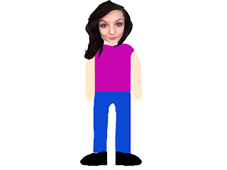
This is my character design for Katie, I have animated the character by using auto key framing on After Effects, I imported a photoshop file retaining the layer sizes in a composition, from there I used keyboard shortcuts such as "W" for Rotate, "Y" for Pan Behind Tool, which allowed me to change the centre point of the layers for different parts of the characters body. I used auto key framing and moved the centre point of the layers and then rotated them to animate the body parts, I found this technique easier than the puppet technique however it does make the movements quite robotic.
Friday, 11 November 2011
Character Animation- Hierachy
This animation was made in a similar way to the puppet one however, this was done with a heirachy of layers. Each layer made up a part of the character. The layers were imported from Photoshop, in a composition retaining the layer size this allowed me to edit each layer, I could use the pan behind tool for moving the centre point of the layer so that when the layer for something like the forearm was rotated, it rotated around that centre point. I found this technique for character animation easier and better than the puppet technique.
We also explored The puppet starch tool and the puppet overlap tool, the puppet starch tool allowed me to stiffen up specific parts of the character if i didn't want them to move as much and the puppet overlap allowed me to make certain limbs overlap/underlap other parts of the character E.g The arm going behind the characters back.
Character Animation- Puppet
This animation was made on Adobe After Effects using the Pin Puppet tool, After importing the character from Photoshop I used the tool to animate the limbs of the body, I clicked with the Pin tool on the joints of the arms and legs and then using the pin point, which I could move; The points would make the limbs move. Although it is a way to animate it is not a very comprehensive way.
Thursday, 10 November 2011
Storyboard Designs for Animation
These are the storyboard sheets for my Digital Skills animation based on my Digital Skills partner Katie. The story is a simple on which consists of Katie playing Mario Kart on the Wii, she suddenly gets sucked into the tv and becomes part of the game, the tracks are in her 2 favourite places "A Pub" and the French island "Il De Re", I've added in scenes such as driving on a formula one racing track along side Lewis Hamilton, and the race also takes place under the sea, Finally the race ends in one of Katies favourite places and she wins the cup, however it all turns out to be a dream as she wasn't actually playing the Wii at all.
Tuesday, 8 November 2011
Character Designs- Continued
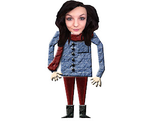
This is one of the character designs after more development. I took a good look at the British Gas adverts and realised how the characters are in an obvious caricature style therefore the heads are purposely made disproportionate to the rest of the body. I took that into account and made sure that Katies head was bigger compared to her body.
To make sure that the body was a bit more life like than before; but not too realistic, I used images of different textures from the Internet. From these images I cut out various shapes depending on what type of clothing I wanted Katie to wear. I tried to make sure that the legs were quite thin as well as the inclusion of pointy feet. I think this technique worked well as the textures complimented that shapes they were cut into and the character designs were beginning to look more impressive. for the hands and skin around the neck area I used a cube with a specific colour for the skin and cut out a hand shape using the "Lasso Tool".
 Continuing with the same technique I made another "Katie" this time with a different costume, With this costume I played around with the affects trying to see how I could make the body stand out along with the face.
 I made seperate layers for things such as buttons, pockets and a scarf and then applied Layer Effects to all of these. I did this by double clicking on a layer and a dialogue box labelled "Layer Style" This allowed me to apply different effects such as: Bevel and Emboss, Contour, Drop Shadow and Satin.
These effects made parts of the clothing such as the Coat to look rippled and creased and the Pocket and buttons looked raised. I even applied the Bevel and Emboss effect to the hands of Katies character. I thought that it looked good as it gave the hands a "3D feel" whilst also maintaining a cartoon style. Overall I was very pleased with these designs. I can continue to make these using various effects and a variety of different clothing/costumes.
Character Designs- Original Design
 This is the original character design for my partner Katies Character. I made this by initially cutting out Katies face and hair from a photograph of her. I did this using various tools in Photoshop such as the "Lasso Tool", "Polygonal Lasso Tool" and the "Magnetic Lasso Tool". This effectively made sure that I had 2 seperate layers. One layer of Katies face and another layer for her hair.
Once I had the two layers, I made sure that Katies face was on top so that the hair didn't block it. Inspired by the British Gas adverts I wanted to make a character with a live action face but then a cartoon body. I begun my test by drawing a generic body for Katie, I didn't like this as a character design as it looked boring and not very good overall, but it helped me see how Katies character would look without a real life body. Seeing as this design looked slightly like a cartoon, going back to this design I added a layer effect to the body of this character.
This effect added a black outline round the character depending on whichever layer I applied the effect to, I think this improved the character design in terms of a "cartoony" look. However I was still not satisfied with the design overall.
Sunday, 6 November 2011
Spotlight Animation- Using masks on After Effects
This is an example of using masks in After Effects, I cut out the Mona Lisa from the picture frame using a subtract mask and then using another mask i placed the "Keep calm and carry on" poster into the frame. I then used a mask for the spotlight, Animating the movement of the spotlight until it finally finds the poster.
Quad Bike Animation
This is another session, learning the basics of Adobe After Effects. Here we used the different photoshop layers of the wheels and the body of the quad bike. we made each of the wheels move seperately. With the inclusion of parent layers both the wheels followed the body layer of the quad. The wiggle effect was also used on the quad to give the impression it is rumbling as the bike moves. The floor and background both move across the page to give the illusion that the bike is moving.
Subscribe to:
Comments (Atom)


